Inequality
Inequality is a broader concept than poverty, defined across the whole population rather than just the poor1.
As with poverty, our job here is to take the intuitive notions we all have about whether some state is more or less equal than another and make them operational, so we can make broad but reasonably precise statement about the inequality of society and how possible reforms might change it.
I’ll start with a simple table and a diagram. In table 1 column we show all the incomes of the people a little economy. They’ve been sorted from the poorest at the top to the richest at the bottom. You can change the numbers in the income column (but please wait till we’ve explained them!). Next to that is the cumulative population - the sum of all the population up to that point; so the first cell is 1, the next 2 (1+1) and so on. Then we have the sum of incomes up to that point (so the first is 10, the next 10+11=21 and so on). Finally we have two columns which just re-express the cumulative populations and incomes as a share of the totals (the totals are recorded at the bottom) - as with poverty, a lot of the work on inequality is done using proportions and shares rather than absolute levels. Since the total income is 145, and the poorest two people have 21, the share of the bottom two is 14.48% (100*21/145), and so on.
The graph to the left charts the cumulative population share on the x- axis against cumulative income share on the y-axis. This is the lorenz curve and this simple thing is probably the best tool we have for thinking systematically about inequality.
If you try changing the numbers in the income column, you’ll see that the other columns get recalculated and the chart redisplayed. We invite you to get a feel for this by experimenting. In particular, please try:
- what happens to the Lorenz curve when all the incomes are equal - so, all the incomes cell have the same numbers in them? (Can you predict the Lorenz curve before you try changing the numbers?)
- what happens when the distribution is completely unequal - so the first 9 incomes are zero and the top one has everything? Again, can you draw what you think the Lorenz should look like before you try?
You’ll have seen (and may have realised anyway) that with perfect equality, the Lorenz curve is a straight diagonal line. With perfect equality, the first 10% of the population have a 10% share of income, the first 20% of population have 20% of total income, and so on.
With perfect inequality, the share of everyone but the top person is zero, and the top person has 100%.
So, the more equal a country is, the closer the lorenz curve will be to the diagonal, and, conversely, the more unequal it is, the more the curve will be bowed away from the diagonal. Again, we invite you to play with the incomes to confirm this for yourself.
The Gini Coefficient - The Standard Measure of Poverty
The Gini Coefficient is a a nice way of summarising this, and is the most widely quoted inequality measure. In the diagram below we’ve shaded the area between the perfect equality diagonal and the actual Lorenz curve in yellow.
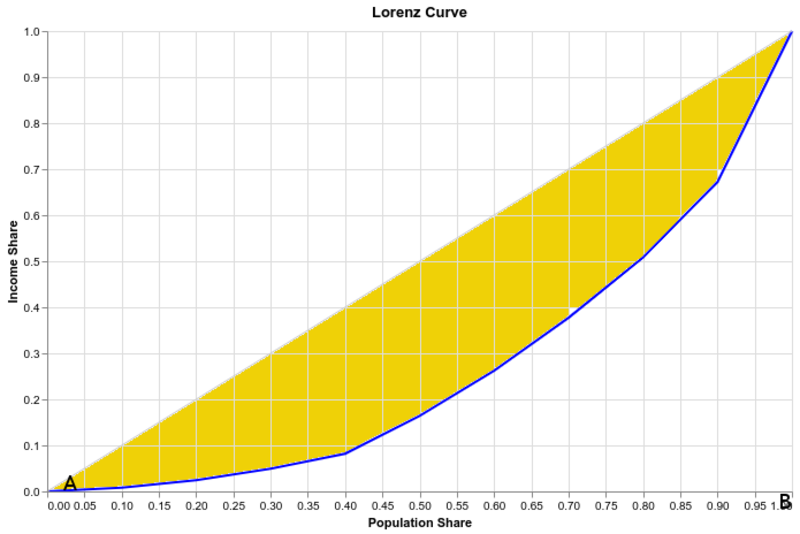
The bigger the yellow area the greater the inequality. The Gini Coefficient just expresses this area as a percentage2 of the triangle ABC in the diagram. Complete inequality gives a Gini of 1, and complete equality gives 0.
Chart 2, below, from the World Bank shows some international comparisons of Gini Coefficients3
| country | Gini (%) |
|---|---|
| Australia | 35.8 |
| Czech Republic | 29.9 |
| Denmark | 28.2 |
| UK | 33.2 |
| USA | 41.5 |
| South Africa | 63.0 |
You can see that the UK has a high inequality by European standards, but a low one compared to the USA or South Africa.
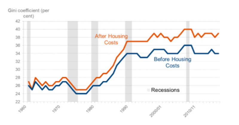
And here is a chart showing the UK Gini Coefficient over time, using many years of our HBAI data we encountered earlier.
 Source:4
UK Inequality rose sharply during the Thatcher administration but has been roughly steady since then. The 2008 recession actually reduced inequality on the Gini measure, mainly by wiping out some very high incomes in the financial sector.
Advanced Measures of Inequality
There is a huge technical literature on inequality. Many other summary indexes have been proposed, each with different desirable properties5. For example:
- the Theil index has the feature that it can be neatly disaggregated to show the contribution of different groups to inequality; for example, the rise in UK inequality in the 80s and early 90s was accompanied by large changes in Regional inequality. With the Theil index one can split changes in overall inequality into changes in inequality between regions (London vs the South East, for example) and changes within regions (greater inequality in London between financial workers and the rest);
- The Atkinson index allows inequality to depend not just on the distribution of income, but also on the analyst’s (or society’s) views on inequality (“Inequality Aversion”);
- The Palma Index6 has recently become popular - it’s simply the ratio between the share of the richest 10% of the population and the poorest 40%.
As with poverty measures, there’s a tension between how sophisticated these measures are and how easy they are to explain to non-specialists. The Palma index, in particular, is very easy to explain, and so has become very popular, but arguably lacks a strong basis - it clearly violates Dalton’s principle, for example, since upward redistributions within the bottom 40%, the middle 50, or the top 10%, do not change the value of the Palma.
Activity
What happens to poverty, inequality, and mean and median incomes if:
- Britain welcomes a group of Russian oligarchs? Answer: inequality ↑ , poverty (both absolute and relative) ≈, mean income ↑, median ≈)
- Britain welcomes a group of penniless refugees? Answer: inequality ↑ , poverty↑, mean ↓, median ≈)
- All incomes in Britain increase by 5%? Answer: inequality ≈, absolute poverty ↓ relative poverty ≈, inequality ≈, mean ↑, median ↑)
- all incomes increase by £10pw? Answer: absolute poverty ↓ relative poverty ↓, inequality ↓, mean ↑, median ↑ )
Bank, World. “World Development Indicators DataBank,” 2019. https://databank.worldbank.org/reports.aspx?source=2&series=SI.POV.GINI&country=.
Cobham Alex, and Sumner Andy. “Is Inequality All About the Tails?: The Palma Measure of Income Inequality.” Significance 11, no. 1 (February 2014): 10–13. https://doi.org/10.1111/j.1740-9713.2014.00718.x.
Haughton, Jonathan, and Shahidur R. Khandker. “Handbook on Poverty and Inequality.” The World Bank, March 2009. http://documents.worldbank.org/curated/en/488081468157174849/Handbook-on-poverty-and-inequality.
Work and Pensions, Department for. “Households Below Average Income: 1994/95 to 2017/18.” GOV.UK, 2019. https://www.gov.uk/government/statistics/households-below-average-income-199495-to-201718.