Some Concepts
Economics is about people - about how people behave, and whether we can make people better or worse off in some sense. But there are a lot of people - 60m in the UK, and every one is different. In principle we could just list the effects of some tax change on all 60m, but without some organising principles it would be impossible to make sense of the results. If we are going to get anywhere here we need some abstractions.
So, in this section, I’ll start by briefly revisiting the summary statistics you met in block 1 - means, medians, totals, and some simple charts. In subsequent sections we’ll then briefly discuss poverty, inequality - these everyday words have distinct technical meanings here1. Mostly we’ll be talking about people’s incomes, but before we get on to the model, I’ll briefly double back and discuss what the thing that we’re trying to summarise should be: should it be people’s income, or consumption, or should we go directly for some measure of happiness? Do we need to account for different living arrangements?
Summary Statistics
Here’s a picture of one measure of the UK income distribution, as a bar chart.
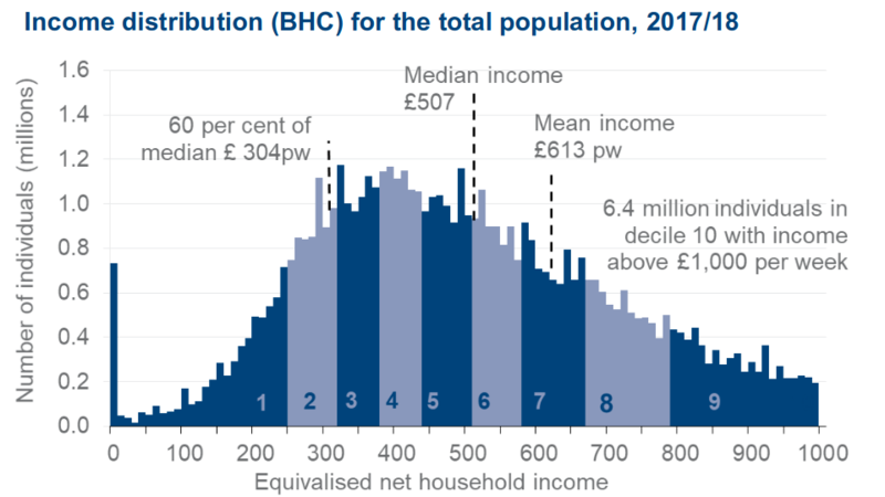
This comes from thee Department for Work and Pensions (DWP) Households Below Average Income (HBAI) data series2
This shows distribution an official UK measure of income for the financial year 2017/83, the latest available at the time of writing:
The income measure is “Equivalised Net Household Income, Before Housing Costs”. In the sections that follow we’ll discuss in some detail what you should take each of those words to mean, and consider some other possible measures. But for now, just think of it as “UK income”.
The chart uses data from the Family Resources Survey (FRS),4 a large annual survey that provides detailed information about the incomes and living circumstances of households and families in the UK. The microsimulation model used later in this section also uses the FRS. The FRS is one of several large UK surveys. I’ll further discuss large sample surveys below, and let you explore the FRS using our tax-benefit model.
There’s a lot of useful material in this graph. Income in £per week is on X-axis, in £10 bands, and an estimate of the numbers of people in each band on the y-axis.
The chart is a little misleading in that it stops at £1,000pw. In reality, there are people with incomes higher than that - literally off-the-scale - so the full graph stretches far to the right. It’s likely that the chart is truncated at £1,000 because very high incomes are hard to measure; I’ll return to this point later,
It’s useful to be able to summarise this data in various ways. The mean and median that you encountered in block 1 are useful:
- The Mean income is £613;
- the Median £517: half the population is richer than the median, and half poorer;
Note how the mean income is nearly £100 higher than the median. This is because there are a large number of relatively small incomes (around where the graph peaks), but a few very large ones out to the right (incomes are ‘skewed right’). The large incomes pull the mean up away from the median. Right-skewed data like this is very common in economics - not only income but the size of companies or national incomes of countries, or the distribution of wealth or consumption.
Activity
Open this spreadsheet. It contains some income distribution data for an imaginary country of 1,000 people. Incomes are heavily right-skewed.
Find the minimum, maximum, mean and the median. Ans:
min 43.69 max 22,640.63 mean 1,696.22 median 1,043.17
Draw a bar chart similar the HBAI chart above (don’t worry about creating the shading). Ans: should look a bit like:

Now double the income of the 10 richest people. What happens to the mean and median. Ans:
min 43.69 max 45,281.25 mean 1,857.70 median 1,043.17
Other things to note
The insensitivity to changes at the very top that you see in the activity is why the median is often preferred to the mean in economic discussions. Very high incomes are hard to measure in sample surveys, because it’s hard to persuade very rich people to participate, because those rich people who do participate may understate their income, and because the circumstances of the rich can be too complex to fit easily into a standard survey, and so recorded top incomes are uncertain and tend to jump around from year-to-year5.
When you hear a discussion about how some change affects an “average person”, you should remember that an average person could well be comparatively rich.
A couple of other things of note in that graph.
- The Line marked “60% of median (£304pw)” is the official UK poverty line - 60% of median income for that year (note the use of median over mean, for the reasons we’ve just discussed). We return to poverty below.
- The chart is shaded into
deciles. The dark area on the left labelled “1” contains the poorest tenth of the population, the lighter area labelled “2” to the left of that is the next poorest tenth and so on. Chopping the population up like into progressively richer chunks is a simple but very useful trick. For example, you can see that the mean is 1/2 way up the 7th decile, so about 65% of people have an income less than the mean6, and that the poverty line is just below the start of the 3rd decile, so about 18% of people are in poverty, on this measure. We’ll be using deciles a lot in what follows
Often, when we are trying to understand complex data like this one, the best place to start is by drawing pictures of it. The HBAI chart above is a particularly rich one, with, as we’ve seen, lots of different facets, and I’ll come to a few other standard charts as we go on.
Burkhauser, Richard V., Nicolas Hérault, Stephen P. Jenkins, and Roger Wilkins. “Survey Under-Coverage of Top Incomes and Estimation of Inequality: What Is the Role of the UK’s SPI Adjustment?” Working Paper. National Bureau of Economic Research, June 2017. https://doi.org/10.3386/w23539.
DWP. The Family Resources Survey, 2019. http://research.dwp.gov.uk/asd/frs/.
Work and Pensions, Department for. “Households Below Average Income: 1994/95 to 2017/18.” GOV.UK, 2019. https://www.gov.uk/government/statistics/households-below-average-income-199495-to-201718.